How to Visualize US Airline Connections in Google Earth
09 Aug 2014For this visualization, I wanted to provide a step-by-step set of instructions for any who may want to try this themselves.
Airline Data
The data for this can be found here. I got the idea from a Gephi forum thread discussing the GeoLayout plugin (which we'll be using). The data is anonymized (does not contain airport names) but contains the latitude and longitude data we need to render it in Google Earth.
1. Gephi Setup
If you don't have Gephi installed go download it here (note, it requires Java 6). In order to do this visualization, two plugins will be needed. So go to "Tools" then "Plugins". Click on "Available Plugins" and search for "ExportToEarth". Select that plugin. Next, search for "GeoLayout" and select that plugin as well. Finally, click "Install" to install these two plugins. Follow any necessary prompts to do so including restarting Gephi to complete the installation.
2. Loading the Data
Once Gephi is started and the plugins are installed, click on "File" then "Open..." and select the airline file downloaded from above. You'll see something like this:
Gephi defaults to randomly laying out newly loaded data, so it may look a bit like a hairball. That's expected.
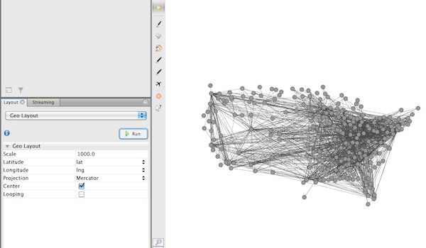
3. Layout the Data
Technically, this step is not necessary. But it does highlight a useful feature in graph layouts. In the "Layout" tab, select the "Geo Layout" plugin. Before running it, make sure the "Latitude" and "Longitude" properties are set to use the respective fields from the data set ("lat" and "lng"). Click "Run" and see it re-situate the nodes on the graph based on their respective coordinates. Try playing with the "Scale" and "Projection" to experiment with different ways to lay out the graph.
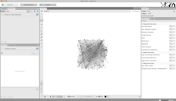
4. Add Some Color and Sizing
On the right, click on the "Connected Components" "Run" button. This detects disconnected components of the graph. In this case, there is only one component. On the left, click on the "Partition" tab and make sure "Nodes" is selected. Click on the refresh icon and then select "Component ID" and then "Apply". If you'd like to change the color, click and hold the color next to the component label ("0" in this case), drag over the color you desire, then click "Apply" again.
Next, back on the right, click the "Average Degree" "Run" button. Then back on the left click the "Ranking" tab next to the "Partition" tab. Select the icon that looks like a gem (the "Size/Weight" icon), Then select "Degree" and click apply.
All together, it should look something like this:

5. Export to Google Earth
To export to Google Earth, go to the "Preview" tab. Click on the "Refresh" tab to visualize the graph here. Click on "File", "Export", then "Graph File...". Change the "File Format:" to KMZ and choose a location to save to (wait a moment for the save to complete).
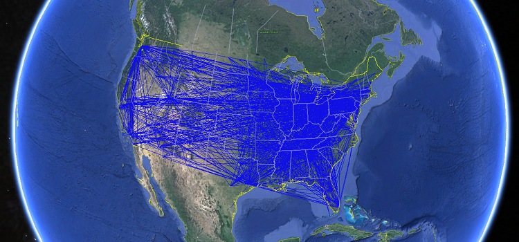
Next, open up Google Earth and choose "File" then "Open...". Navigate to where you saved the KMZ file, open it, and you'll see something like this:
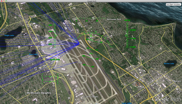
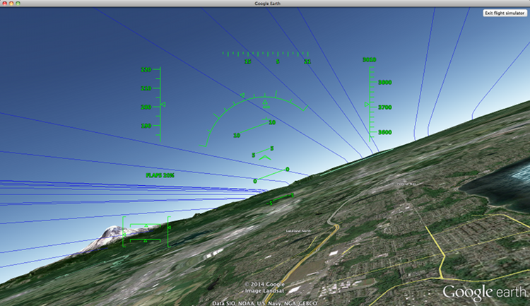
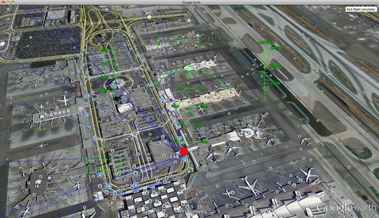
6. Bonus: Flight Simulator Mode!
One thing I discovered is that not only can you view your graph looking down but your graph is visible inside flight simulator mode. Simply click on "Tools" and "Enter Flight Simulator...". Select a major US airport you are familiar with or zoom in on one and click "Start Flight". You can use the graph as navigation guides to fly between airports. Simply pick an edge and follow it to the airport it points to. What's interesting to see is that the edges are not merely flat on the ground but are at different elevations.
Here are some images of what this looks like in flight simulator mode: