How To Visualize Your Facebook Friend Network
28 Aug 2014Intro
There are apps that will generate certain types of network visualizations of your Facebook data. However, this guide is aimed at those who would like to dig deeper into their own data and have more control into how it is visualized. Often visualizing and analyzing graphs and networks requires a certain amount of effort to familiarize yourself with the data to gain intuition on how the data is related.
The fun part of this walk through is that you are already the expert on your own network of friends so seeing how things group will make this exercise intuitive. But what really makes it exciting is when the network illuminates relationships, connections, and groups in your friend network that you didn't know existed. Often you'll find you can talk to friends about new common interests or connections to other people you both know that you may not have known about previously.
1. Install Gephi
If you haven't installed Gephi already, you can do so by going here. It's free and runs on Mac, Windows, and Linux.
2. Get Your Facebook Data
To download your Facebook data in a format that Gephi and read I'll be using this netvizz Facebook tool. Click on the "personal network" link then click "Start". You'll need to grant permission for the application to walk your Facebook friend network. After it is finished generating the network, right-click on the "gdf file" link and click "save as...".
3. Load in Gephi
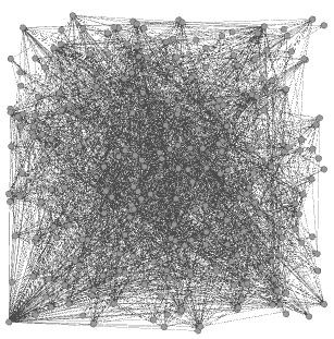
Open Gephi then click on "Open Graph File..." and select the file you previously downloaded from netvizz. Make sure to keep the "Directed" check box selected. Gephi loads the network in a random placement by default so it will look something like this initially:
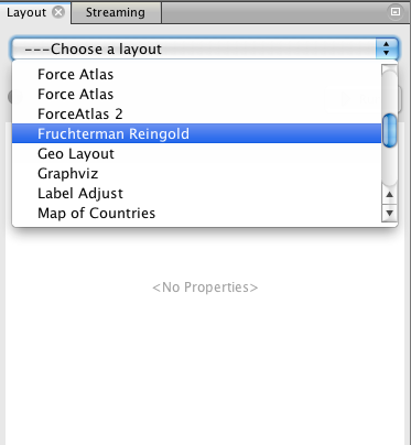
4. Layout
A graph/network layout is the algorithm used to position nodes. There are many different kinds of layouts. For this walk through, we will be using the "Fruchterman Reingold" layout which is a kind of force-directed layout. Select the layout using the "Layout" tab on the left:
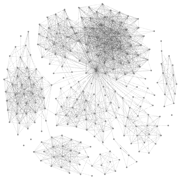
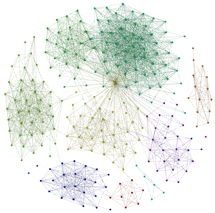
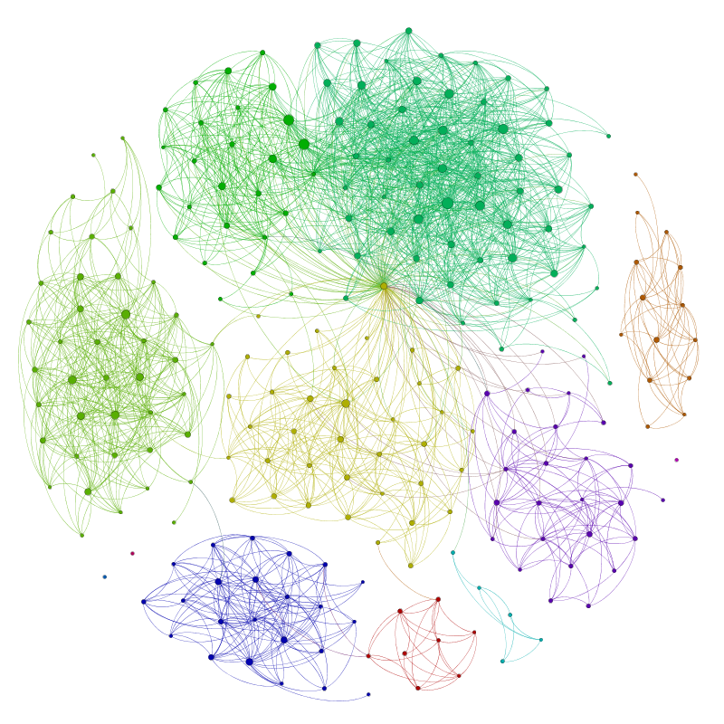
After selecting the "Fruchterman Reingold" layout click "Run". This layout has no point where it will stop on its own. Just watch it run until the node placement settles down. You'll notice that your network of Facebook friends is already clustering into several distinct groups. It might look something like this:
You don't have to stick with this layout. Try experimenting with other layouts like "Force Atlas", or "Circular Layout". There are also more layout algorithms you can install as plugins by going to "Tools -> Plugins" and searching for "layout".
5. Community Detection
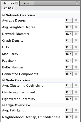
Already, you're probably noticing clusters or communities of nodes. The human brain intuitively sees these patterns. To get Gephi to detect them, run the "Modularity" statistic under the "Statistics" tab on the right (just use default detection settings):
Next let's add some color based on those different communities so they stand out better. Close the modularity report it generated and then click on the "Partition" tab on the left:
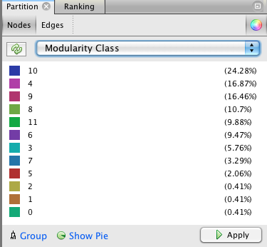
Select the "Modularity Class" from the drop down (you might have to refresh it using the refresh button to the left of the drop down) and then click "Apply". At this point, your graph might look something like this:
If you don't like the colors you can tweak them by right-clicking on one of the color squares and clicking "Randomize colors". You can also left-click and hold on one of the squares to change its color from a color picker.
6. Ranking
Ranking is the process of ranking nodes by a certain numeric criteria. Currently, your friend network doesn't have much you could sort your friends by. The statistics tab on the right has several different algorithms to run that will assign a number to each node (friend) in the network based on some criteria. I won't describe every single one here, but for the purposes of this guide I'll be choosing to rank by "In-Degree".
Degree is simply the number of connections a node has (in or out). In-degree is the number of connections that point from other nodes into a node. Conversely, Out-degree is the number of connections that go out from a node to other nodes. In the context of the Facebook network here, In-degree is the number of your friends who are also friends with a particular friend. So a friend with high "In-degree" would be a friend that is well known amongst your friends. This seems like a reasonable ranking to use -- a kind of informal "popularity" ranking.
To calculate degree use the "Statistics" tab on the right and run the "Average Degree" statistic. Close the report after it is generated and click on the "Ranking" tab on the left:
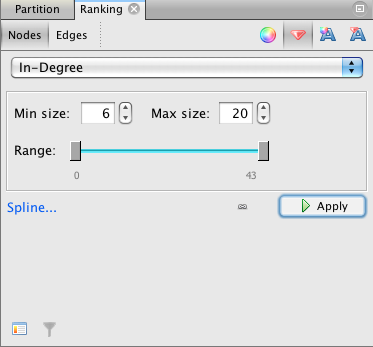
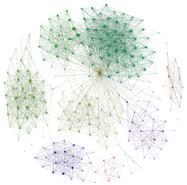
Click the red icon (that looks something like a ruby or diamond), select "In-Degree" from the drop-down list, and click "Apply". The node sizes will change based on this ranking. The larger the node, the larger its "In-Degree". Try tweaking the "Min size" and "Max size" to your liking. You can also change the "Spline..." setting to change the type of rank scaling to use. Your graph should look like this now:
7. Exploring the network
Before we export the graph into a nice-looking image let's take some time to explore the graph. Click on the "Edit" icon on the left the graph (it looks like a mouse pointer with a question mark next to it). Note, you may have to click twice on the icon to get it into the right mode. You want the "Edit" tab to appear on the left. Now zoom/pan around your graph and click on nodes to see what friends specific nodes represent. Here are some things to try:
- Click on a few friends in a particular community/group of nodes and ask yourself what they all have in common. This will give you a sense of what that group could be labeled.
- Often one particular node will stand out as having many connections. Click on that node. Is it your significant other? A best friend? Notice how they might span several different communities of your friends (particularly their family and your family). Sure enough, the node with the most degree (both in and out degree) is my wife.
- Do you notice which friends might link different communities together? Did you know that they related to both of those groups?
- Do you notice friends who know each other that you weren't aware of? Ask them about it the next time you see them.
- Do you have friends who are out alone on your network? Try introducing them to other friends you have.
8. Export image of the network
Now that you have your network laid out, colorized, and ranked it's time to export it to a nice-looking graph. Click on the "Preview" button at the top of Gephi. At first it the "Preview" pane will be empty. Click on "Refresh" to load in your graph as is:
(names omitted for privacy)
Already it looks quite nice. It should have all of the colors and node sizes you saw before. By default, it uses curved edges which gives it a more organic look.
Now, let's add your friend's names as node labels. Under the "Node Labels" section check the "Show Labels" check box and click "Refresh". It shows your friend's names and sizes them proportionally based on their ranking. You can try the "Box" option to make the names stand out more. Play with the "Box Opacity" to make the box effect the subtlety you desire. Each time you tweak the settings, you'll have to "Refresh" the image.
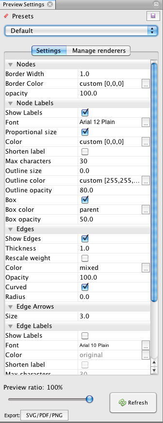
Once the graph is to your liking, click on the "Export" button at the bottom left and select the format you desire. If you choose png be sure to click "Options..." and make the width/height large enough so you can zoom in to see the names.
Conclusion
So that's it. There are other things to do like different layouts, different ranking parameters, degree of separation, and even "attacking" the friendship network. I'll cover these in a later post. If you enjoyed doing this, post your Facebook network to your Facebook page and link to this guide.