How to Visualize Your Twitter Network
02 Nov 2014![]()
Intro
This is the third graph analysis I've done for analyzing your own social networks. Previously I've posted how to do this for Facebook, and LinkedIn. I'll do one for Google+ as well.
Credit
For the extraction of the friends graph I used JP de Vooght's twecoll Python tool.
Export The Data
In order for the tool to work, you have to go to Twitter's application management center
and generate credentials for your own app. Enter the appropriate information and
you will be issued an API Key and API Secret. Copy those into a two-line file
called .twecoll in your home directory. This is where twecoll will look for
authentication information.
Once you have the tool mentioned above (just download it or use git to clone the repository), run the following commands to generate your Twitter friends network. You'll have to visit a Twitter OAauth page and paste in a token for your authenticated session (twecoll will prompt you in how to do so):
./twecoll init [YOUR_TWITTER_USERNAME_HERE]
./twecoll fetch [YOUR_TWITTER_USERNAME_HERE]
./twecoll edgelist [YOUR_TWITTER_USERNAME_HERE]
(install any missing Python modules using easy_install)
These commands can take a very long time (several hours) due to Twitter's API rate limit restrictions. I started it running, verified that it was working, then left it to run overnight (it took 5-6 hours for my graph).
Load The Graph in Gephi
The result of the above will be a GML file [YOUR_TWITTER_USERNAME].gml. This
file can be opened inside Gephi. twelcoll adds an edge weight and rank which
affects the visual width of the edges in Gephi. I did not want variable edge
weight, so I cleared those out using the following Linux command:
cat JonesWCaleb.gml | grep -v weight | grep -v rank > JonesWCaleb-no-rank-weight.gml
Once opened inside Gephi, I did a typical analysis and visualization using community detection/colorizing, selecting a layout, and ranking node size based on in-degree (for their followers). Examples of how to do this can be found in my post on how to visualize your Facebook friend network. For the images below, I used a force-atlas layout with some modified parameters to give it more spacing. I also filtered nodes that didn't have any connections to focus on the main connected component.
When I was filtering out the edge weight and rank, I noticed that twecoll had
downloaded every avatar for each of the Twitter users in the network. Gephi has
a plugin that lets you visualize your network using pictures instead of circles
as nodes. In order for this to work, the plugin requires an image node property
with a path to an image file. twecoll used this image property name so that
worked right out of the box. Well, mostly, I ended up having to use Gephi's
"Manage Renderers" options in "Preview" mode and unselecting "Default
Nodes" to hide the circular nodes.
Result
Here's what my Twitter network looked like:
![]()
(SVG here)
Analysis
I use my Twitter account almost exclusively for professional networking. My friend network had four major communities in it:
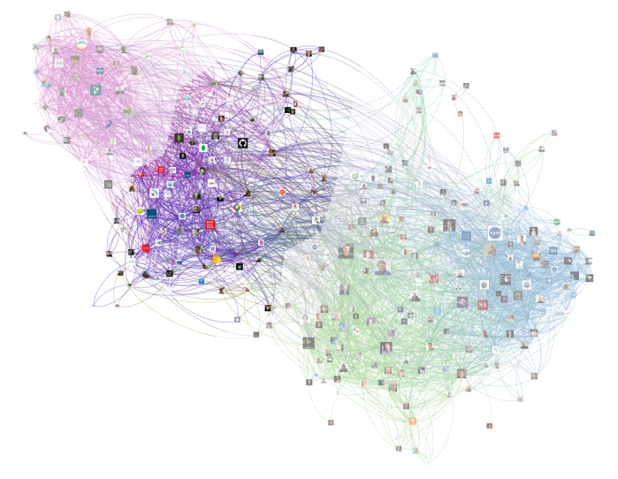
Graph Community
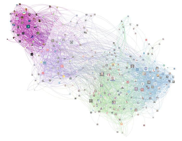
A little-bit meta, but this community consists of fellow graph and network enthusiasts, inventors, leaders, and companies of graph/network related technology:
Key connectors in terms of in-degree (number of followers) are:
Tech Community
This is the community I initially started with as I first started following individuals or companies which invented technologies that I work with:
Key connectors here are:
Abundance Community
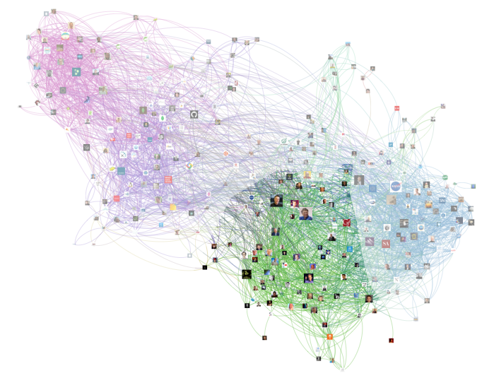
A while back I read the brilliant book "Abundance" by Peter Diamandis and Steven Kotler. While reading the book it occurred to me that many of the innovators and leaders mentioned in that book were on Twitter. So I followed many of them and created an Abundance Twitter list.
Key connectors here are:
Science/Space Community
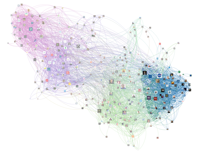
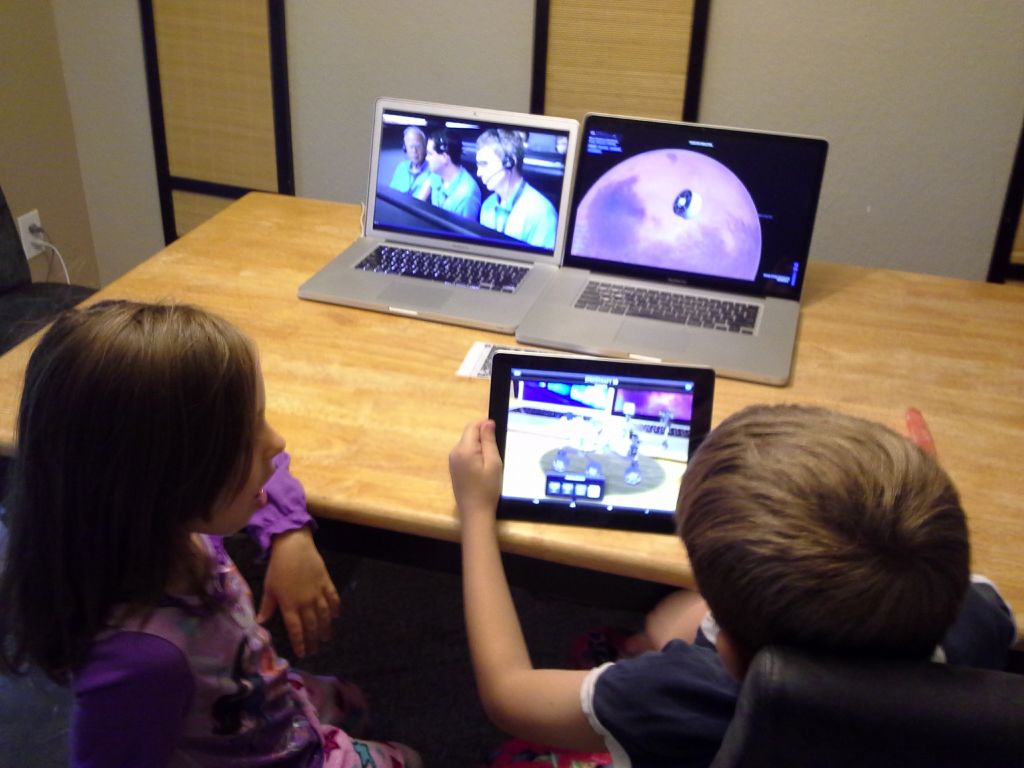
I am a huge space and science fan. Here's a picture of my giving my children a bed-time approved replay of the Mars Curiosity landing the next evening:
Here are the key connectors for this community in my network:
One More to Go
I've now done this kind of extraction, visualization, and analysis for Facebook and LinkedIn. I plan on doing for one Google+ in the future. See the related posts section below to look at those posts.